Microsoft’s official GitHub training materials once featured a flowchart so riddled with errors it read like a glitchy AI experiment. The diagram, meant to illustrate Git’s branching model, was a near-perfect parody of the original—complete with misspelled words, misaligned arrows, and a vertical axis labeled ‘Tim’ instead of ‘Time.’
The source? A meticulously designed chart created by software engineer Vincent Driessen in 2010. His version, shared freely for years, became a standard reference in developer circles. Microsoft’s take? An AI-generated mishmash that swapped ‘feature’ for ‘featue,’ ‘merged’ for ‘morged,’ and turned clean typography into a visual joke.
The original diagram was a product of deliberate design: Driessen spent hours refining colors, curves, and layout to clarify how Git branches evolve over time. His work was licensed for reuse, appearing in talks, wikis, and tutorials—always with credit. Microsoft’s version, however, erased those origins entirely. The company’s official Learn portal now hosts a replacement, but the incident exposes deeper flaws in how AI tools handle technical content.
A Decade of Influence, One AI Glitch Away
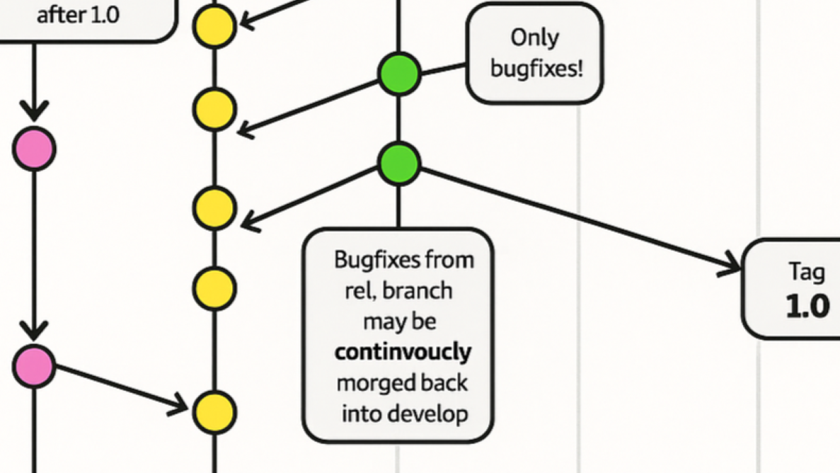
Driessen’s diagram wasn’t just popular—it was foundational. For 15 years, developers relied on it to teach Git workflows. The original included editable source files, encouraging modifications and adaptations. Yet Microsoft’s AI tool treated it as disposable: no credit, no link, just a regurgitated approximation. The result wasn’t just lazy—it was a step backward. Arrows that once pointed with precision now veered wildly. Intentional gray shading became stark black. And the word ‘continuously’ devolved into ‘continuocly morged,’ a phrase that doesn’t exist outside of Microsoft’s output.
The fix? Microsoft removed the flawed diagram and replaced it with an alternative. But the damage lingers. The incident underscores a growing problem: as AI tools churn out technical content, how do we ensure accuracy, attribution, and quality? Driessen’s frustration isn’t with plagiarism—it’s with the process. ‘This isn’t inspiration,’ he noted. ‘It’s taking something that worked and making it worse.’
What Went Wrong?
- No original intent retained: The AI ignored Driessen’s design principles, turning a clear educational tool into a chaotic mess.
- Attribution vanished: Unlike past adaptations, Microsoft’s version erased all traces of the source, despite the original being openly shared.
- Technical integrity failed: Errors like ‘Tim’ instead of ‘Time’ and ‘featue’ instead of ‘feature’ suggest AI tools still struggle with nuanced technical terminology.
The replacement diagram on Microsoft’s Learn portal offers no explanation for the change. Users scrolling through the tutorial would have no way of knowing a glitch occurred—let alone that it stemmed from a decade-old diagram’s uncredited AI remix.
Broader Implications
This isn’t the first time AI tools have produced technical inaccuracies. But the scale of Microsoft’s oversight—using a trillion-dollar company’s official platform—makes it a cautionary tale. Driessen’s diagram was well-known enough to be flagged, but what about lesser-known works? As AI-generated content floods documentation, tutorials, and training materials, the risk of unnoticed plagiarism or errors grows. The question isn’t just about credit; it’s about trust. If a foundational technical diagram can become unrecognizable through AI processing, what else might slip through?
Microsoft has yet to on the incident. But the episode serves as a reminder: even with advanced tools, human oversight remains critical. The best technical explanations aren’t just generated—they’re refined, tested, and attributed. And in this case, the AI missed the mark entirely.