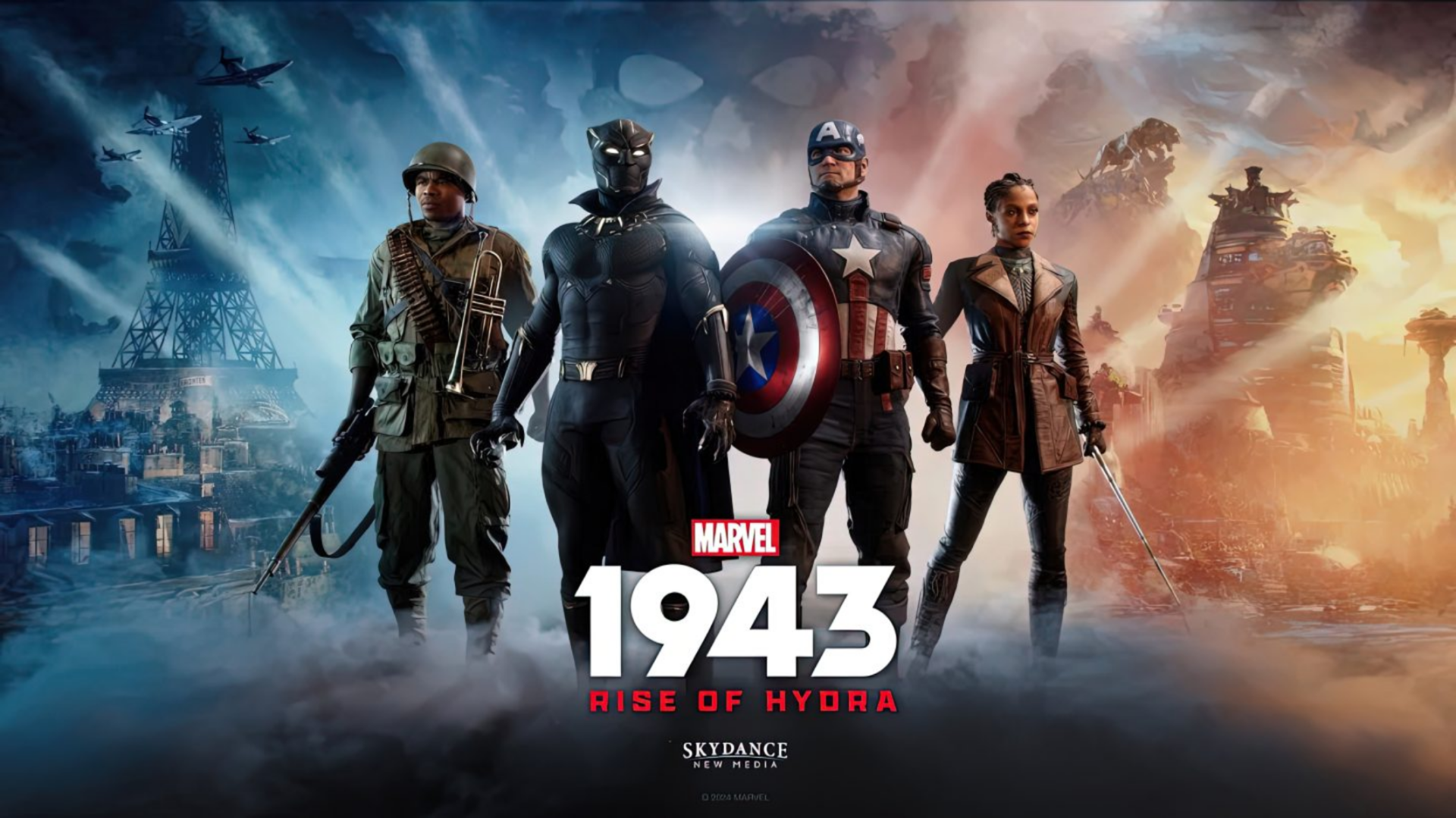
A single letter can carry the weight of an entire franchise. In gaming, the letter 'A' serves as more than just typography—it becomes a visual shorthand for worlds, themes, and narratives. Unlike other letters bound by geometric constraints, the 'A' offers designers a canvas of open arms, a structure ripe for reinterpretation.
From Symbol to Story
The letter 'A' in gaming logos often transcends its alphabetic roots. It morphs into architectural frameworks, character silhouettes, or even environmental elements—each iteration telling a story without words. For instance, one prominent logo uses the 'A' as a gateway, its open arms framing a figure poised on the threshold of adventure. Another reimagines it as a digital landscape, where the letter’s negative space becomes a sky teeming with celestial bodies.
Design Flexibility in Action
The versatility of the 'A' is evident in its ability to adapt to different genres. In action games, it often embodies movement—dashes, leaps, or even the trajectory of a projectile. Strategy titles might repurpose it as a command center, its structure hinting at control and organization. Even puzzle games play with its form, using the letter’s angles to represent mazes or portals.
Cultural Impact Beyond Typography
The 'A' in gaming logos isn’t just about aesthetics; it’s a cultural touchstone. Players recognize these designs instantly, associating them with franchises that have defined generations of gaming experiences. The letter’s presence in a logo can evoke nostalgia, curiosity, or even a sense of challenge—qualities that transcend the visual and linger in the player’s memory.
Looking Ahead
As game design continues to evolve, so too will the interpretations of this simple yet powerful character. Future logos may push the boundaries even further, blending the 'A' with emerging technologies or narrative elements in ways that redefine what a logo can be. One thing is certain: the letter ‘A’ will remain a cornerstone of gaming’s visual identity.